I want you to imagine where you live. Do you live in a house, an apartment, or a studio? How many people live with you? Are there enough rooms for them? Do multiple generations live in your home? Did you buy your home, or are you renting? Do you have a front yard, a backyard, or neither? Where’s the nearest grocery store? The nearest park? The nearest gym? How long is your commute to work? Do you have a car, or do you rely on public transportation? Do you have easy access to your transportation? Where’s the nearest health facility? The nearest school?
There are innumerable factors that go into choosing where we live, such as accessibility, finances, and space. But what if I told you there are people who did not get to choose where they live and have to endure whatever conditions come with their home? Such is the case for many minority groups in the U.S., who carry a disproportionate burden on their health due to the communities they are forced to live in. And it all started with drawing a map.
Background and Significance
During the New Deal Era of the United States, the Home Owners Loan Corporation (HOLC) drew maps for over 200 cities as part of its City Survey Program to document the relative risk of lending across neighborhoods. Requested by the Home Loan Bank Board, the City Survey Program was a collection of color-coded maps for cities across the country to indicate the risk levels for long term-term real estate investment (Hiller 2016). In a memo about the City Survey Program, the program aimed to help “successfully establish policies with respect to the collection of HOLC loans” and “the management and ultimate sale of acquired real estate” (Aaronson 2021).
Neighborhoods were classified based on “risk-based characteristics” (e.g., housing age and price). However, non-housing attributes such as race, ethnicity, and immigration became influential factors (Aaronson 2021). The City Survey Program deviated from the HOLC from its original mission to provide new mortgages on an emergency basis to homeowners at risk of losing their homes during the Depression. Thus, the program resulted in a series of residential security maps designed to “graphically reflect the trend of the desirability of neighborhoods from a residential viewpoint” (Hiller 2016). These maps, which were often used by lenders, prevented individuals in “less desirable neighborhoods from getting home loans. As a result, these maps created reduced homeownership rates, house values, and rents, which exponentially increased racial segregation in later decades (Aaronson 2021).
Neighborhoods housing predominantly African American residents were often the lowest-rated and drawn in red– hence the term “redlining” came into effect – thus, banks denied credit to residents due to the demographic composition of their neighborhood. Redlining denied access to capital investment which could improve the housing and economic opportunity of residents (Juan 2018). Ultimately, these redlining maps affected the development of urban neighborhoods via reduced credit access and subsequent disinvestment. Throughout the 20th century, both private lenders and federal agencies limited the availability of mortgage credit to racial and ethnic minorities leading to a systemic restriction of mortgage credit in certain geographic areas (Appel 2016).
Impact: Worcester, MA
In the 21st century, this systemic restriction persists in many urban communities. Most neighborhoods (74%) that the HOLC graded as high-risk decades ago are currently low-to-moderated income today, and nearly 64% are presently minority neighborhoods. Gentrification is also associated with greater economic change and greater economic inequality in the HOLC highest-risk neighborhoods, most likely due to decades of depressed home values (Juan 2018). The Community Reinvestment Act of 1977 (CRA) was enacted to combat the practice of redlining by requiring all banks to delineate an assessment area where they will concentrate their lending activities and help meet the credit needs of all their local communities, including low to middle-income communities (Antonakes 2001).
In other words, in response to charges against financial institutions engaging in redlining and discrimination, the CRA was enacted to encourage federally regulated depository institutions to meet the credit needs of all communities, especially low-to-moderate income communities (Ding 2021). However, current CRA criteria present many flaws, thus allowing banks to maintain assessment areas that mostly include higher-income communities and communities with fewer minority residents (Antonakes 2001). The anti-discrimination measures set in place by the CRA may have been effective in the sense of avoiding explicit racial bias against mortgage lending, however in the case of Worcester, Massachusetts, as well as many other cities across the United States, there is still a correlation between race and geographic poverty and home lending to predominantly minority neighborhoods.
When looking at data from the Federal Housing Administration (FHA), there is a statistically significant link between low and median income, low homeownership, and Hispanic and African American populations in the city of Worcester, Massachusetts (Wiemann 2016). According to demographic data surveying all of Worcester County from SG2 Health Care Intelligence, Worcester reports the lowest median 2021 household income amongst its residents alongside some of the lowest projected income increases by 2026. Most residents are not expected to increase their median income in five years by no more than nine percent.

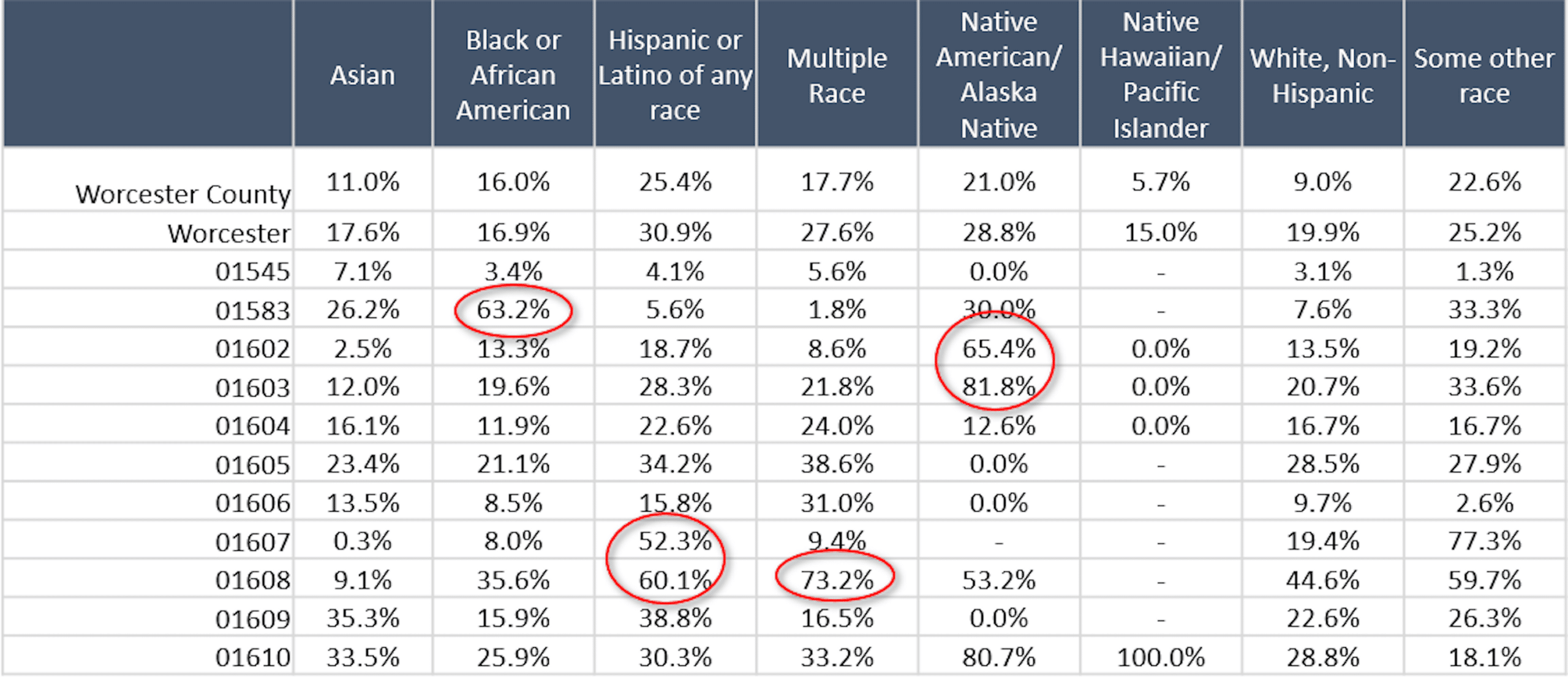
The table above displays the percentage of demographic populations in different zip codes in Worcester living below the Federal Poverty Line. In zip code 01583, over 63% of Black/African American residents in Worcester live below the federal poverty line. More than 1 in every 2 Hispanic/Latino residents in 01607 and 01608 are living in poverty, and 8 in every 10 Native American residents living in 01603 and 01602 are in poverty. These rates are substantially higher than for residents who identify as White in Worcester (U.S. Census Bureau 2019).
Additionally, in Worcester, individuals with the lowest median household income were reported as Hispanic/Latino families. Worcester’s rate of homeownership is 46.6%, yet despite having high homeownership, most housing turnover in Worcester presently appears to be rental units rather than mortgaged homes (Wiemann 2016). In Worcester, over the last forty years, there has been a consistent growth in housing stock, yet the number of people per housing unit declined by nearly twenty percent. According to the United States Department of Housing and Urban Development, a household should not pay more than thirty percent of its gross annual income. However, more than half of Worcester residents are paying more than thirty percent of their income on rent (Worcester 2013).
Impact: Boston, MA
Let’s take the city of Boston as a case study. Boston is notoriously known for being one of the most segregated cities in the country, by race, income and education. However, rarely are there any statistics regarding the variance in life expectancy rates across the city. The Roxbury neighborhood has a life expectancy of fewer than 59 years, but less than half a mile away, residents of Back Bay have Boston’s highest life expectancy of almost 92 years (Lee 2019). So why the terrifying gap? The redlining map for Boston has blue and green areas which are considered desirable, while the red areas are considered hazardous and dangerous. Roxbury is entirely in red.
However, it is not just Boston experiencing such shocking rates of life expectancy. In city after city across the U.S., researchers have found a disturbing pattern: People who live in neighborhoods once subjected to the discriminatory practice of redlining are today more likely to experience shorter life spans – sometimes, as much as 20 or 30 years shorter than other neighborhoods in the same city. Comparing the maps to the current economic status and health outcomes in these redlined neighborhoods today, researchers found higher rates of poverty, shorter life spans and higher rates of chronic diseases, including asthma, diabetes, hypertension, obesity and kidney disease (Godoy 2020).
Redlining made it nearly impossible to buy or refinance thus, houses fell into disrepair, leading to health hazards like mold and lead paint. Industrial sites were more likely to be located near redlined neighborhoods, which meant more exposure to pollution (Godoy 2020). As areas declined, retailers left, including grocery stores, which meant less access to healthy food. These neighborhoods also had less access to parks and other green spaces, meaning fewer places to exercise. All of these factors combined to create an environment conducive to poorer health outcomes.
Conclusion
Redlining maps illustrated a legal devaluation of people and promoted structural racism against people through public policy. Mechanisms such as redlining, which fueled white suburbanization and racial segregation, steadily laid out the foundation for the racial wealth gap and strong division in homeownership rates. Yet, the current state of formerly redlined neighborhoods is not irreversible. There are practical steps toward achieving an equitable and healthy environment for every individual, it is just a matter of whether we are willing to take the steps. Currently, policies and cities should work towards increasing homeownership among low-income and high-minority communities and eliminate the geographic impacts of systemic discrimination. The disparities within society are only as strong as we allow them to persist.
Works Cited
Aaronson, D., Hartley, D., Mazumder, B. 2021. “The Effects of the 1930s HOLC “Redlining” Maps.” American Economic Journal: Economic Policy, 13 (4): 355-392.
Antonakes, Steven L. 2001. “Assessing the Community Reinvestment Act: Impact on Low Income and High Minority Communities.” The Journal of Business and Economic Studies 7 (1): 1-31.
Appel, I., Nickerson, J. 2016. “Pockets of Poverty: The Long-Term Effects of Redlining”.
Ding, L., Nakamura L. 2021. “Don’t Know What You Got till It’s Gone: The Community Reinvestment Act in a Changing Financial Landscape.” The Journal of Real Estate Research, 43 (1): 96-122.
Faber, Jacob W. 2020. “We Built This: Consequences of New Deal Era Intervention in America’s Racial Geography.” American Sociological Review, 85 (5): 739–775.
Juan F., Bruce, M. 2018. “HOLC ‘redlining’ Maps: The Persistent Structure of Segregation and Economic Inequality”. NCRC Research. 1-29
Godoy, Maria. 2020. “In U.S. Cities, The Health Effects of Past Housing Discrimination are Plain to See”. NPR.
Hiller, A. 2016. “Residential Security Maps and Neighborhood Appraisals: The Home Owner’s Loan Corporation and the Case of Philadelphia”. Social Science History. 29 (2): 207-233..
Lee, K., Douglas, M. 2019. “Your Neighborhood Could be Harming Your Health”. NBC Boston.
Weimann, Curtis B. 2016. “Evaluating Home Lending Patterns for Discrimination in Worcester, MA”. International Development, Community and Environment (IDCE). 155.
2013. “Worcester by the Numbers: Housing and Land Use: Worcester Regionals Research Bureau. 13 (7): 1-18
2019. American Community Survey 5-Year Estimates (2015-2019). U.S. Census Bureau.
About the Author
Maia Archer is a Child Health Equity Center Intern and emerging Child Health Equity Scholar with an interest in improving the lives of children from diverse racial, ethnic, and socioeconomic backgrounds. She is a candidate for a Bachelor of Arts in Biology, minoring in French and Public Health, at Boston University and intends to pursue a career in community health with a focus on urban environments.


